Case study · Government benefits & financial inclusion
Modernizing how millions receive federal benefits
A U.S. Treasury and Mastercard partnership to redesign how Social Security recipients — many unbanked or underbanked — receive their federal payments.
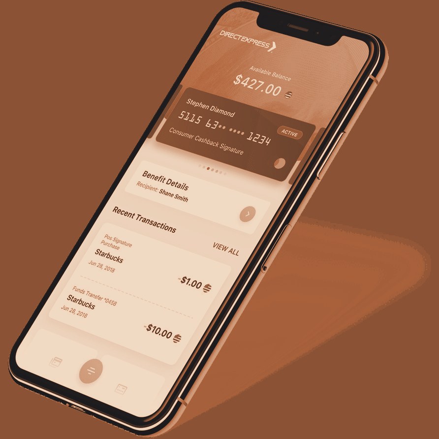
Note: this was UX research that informed the design of Direct Express v1 (circa 2015, the Comerica era). The interface shown reflects its time.
Mailed checks and call-in systems, for the people least served by them
In collaboration with the U.S. Treasury, Mastercard set out to modernize how Social Security recipients — often unbanked or underbanked — receive their benefits. The existing process leaned on mailed paper checks and clunky call-in systems for even basic tasks like checking a balance.
A digital benefit experience people could actually trust
Move benefit payments from mailed physical checks to direct deposits on reloadable prepaid Mastercard cards — and design a digital experience that was easy to access and manage, cost-effective and scalable for the government, and secure, accessible, and trustworthy for a population often excluded from tech innovation.
The research, end to end
- Mapped the problem space and the end-user's goals for the product
- Partnered with Product to define participant profiles and personas
- Coordinated with the market-research vendor on logistics and sourcing
- Built the research plan and discussion guide — money-management behaviors, pain points, available help, and trust signals
- Recruited a deliberately split sample: roughly half were benefit recipients themselves, the other half the caregivers managing benefits on their behalf
- Re-screened to match the personas — older adults and people living with intellectual, physical, emotional, and significant psychological impairments, many with low digital literacy
- Moderated each session against the approved plan, adapting in real time to each participant's capacity
- Synthesized findings to guide the next phase of prototyping and development
- Presented to the client and stakeholders
What the data said — and what people meant
"Trust" beats "innovation"
Users cared far more about knowing their funds were safe and reachable than about any new feature.
A smartphone isn't digital literacy
Many had phones but didn't trust apps — which reframed every onboarding assumption.
Balance-checking was a ritual
For many, calling in to check a balance was a daily anxiety-relief habit. The design had to honor it, not erase it — so balance visibility went front-and-center.
Two users, one product
It had to work equally well for benefit recipients and for the caretakers helping them.
A national benchmark for digital benefit distribution
The resulting changes streamlined onboarding, reduced anxiety through careful UI language, and put balance visibility first. The U.S. Treasury adopted the updated platform, and Direct Express became a national benchmark.
This was the project that made me understand how much UX research truly matters. It's not about making things easier to click — it's about dignity, trust, and systemic impact. I saw how asking the right questions could shape a product that would change people's lives for the better.
A slice of a deeper toolkit — 70+ named research, product, and facilitation methods, drawn from a working library of 175+ structured activities. The right ones get pulled for the problem in the room.